Elegance
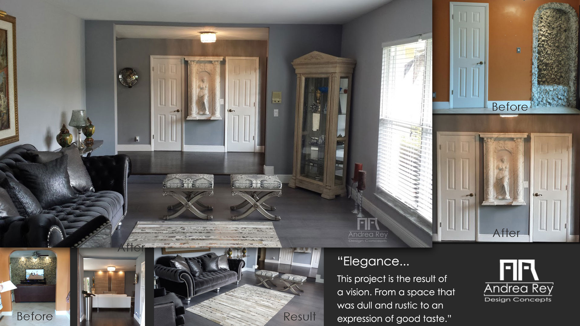
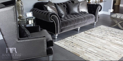
Living room remodeling and redesignThis project is the result of a vision. From a space that was dull and rustic to an expression of good taste.
I renovated the interior by opening certain areas and designing all spaces in accordance with the general concept.
Click the image to open
Hall
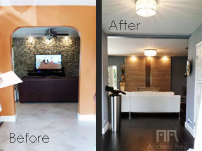
There was a wall in the doorway from the that connected the living room with the hall. You can see the difference after the wall was gone, the space looks wider, the light flows better. I installed additional lamps on the ceiling to improve illumination.
The stone wall in the back was substituted by an ornamental fireplace to add a modern touch to the family area while maintaining the same style of other areas of the house.
Click the image to open
Entry
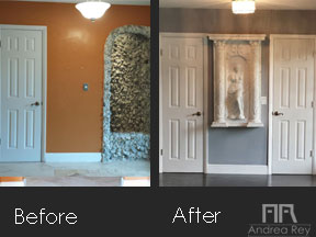
Harmony is the result of remodeling the entry hall of this project. The colors, usability, distribution and lighting are all combined in perfect union.
A touch of classicism was carefully placed to express, in harmony with other areas, the general décor of the house.
Click the image to open
Dining Room
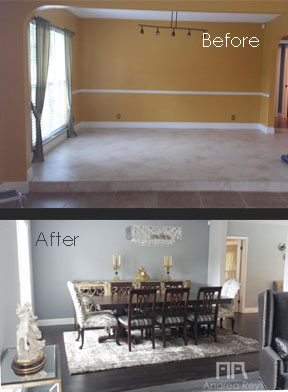
Eat like a king! You may choose the meals to serve but you can't hide the inconveniences that a dining room, if not properly designed, may present. In this case the difference is clear. From the lighting to the colors.
Details
Click the images to open


Comment
